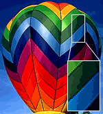
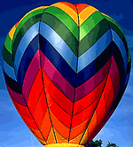
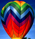
At lower bit-depths, color quantization can reduce smooth color gradients into discernible bands of color (see Figure 1). Dithering is the process of changing pixels in these color transition zones to minimize banding. This feathering process strategically places patterns of available colors to emulate colors eliminated in the color quantization process. The resulting image appears smoother, but dithering makes file sizes larger (see Figure 2).
 |
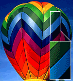 |
| Figure 1: Balloon at 64 Colors Shows Banding (9,121 bytes) | Figure 2: 64-Color Balloon with 85% Dithering (10,052 bytes) |
|---|
The compression algorithms used in GIFs and PNGs are dictionary or substitution-style schemes. LZW and deflate substitute shorter codes for repeated pixel patterns along scanlines. Generally, the more flat-color areas you have the smaller the GIF or PNG. Anything that disturbs this regularity (dithering, drop-shadows, anti-aliased text) will increase either the number of colors or the number of unique pixel patterns and thus increase file size.
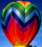
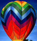
Used judiciously however, dithering can allow you to use lower bit-depths. A 32-color image at 100% dithering is often smaller than a non-dithered 64-color image (see Figure 3).
 |
 |
 |
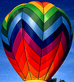
| Original Balloon | 32-color Balloon, 85% dithered = 7,975 bytes | 64-color Balloon = 9,121 bytes |
|---|
The colorful balloon at 32 colors and 100% diffusion dithered is 8,277 bytes, at 85% dithered the dithering was less apparent, and it weighs in at 7,975 bytes. The 64-color balloon is 9,121 bytes with no dithering.
Lossy Compression and Dithering
You can combine “lossy” compression with dithering to compensate for the increased file size. Lossy compression has the opposite effect as dithering does on file size. Lossy compression increases redundancy along scanlines, and makes the LZW and deflate algorithms work more efficiently. At lower values, lossy compression is not easily detected and works well with the patterns that diffusion dithering creates (see Figure 4).
The final dithered and lossy 64-color image has the smooth look of a higher bit-depth image yet nearly the same file size as the 64-color image with no dithering. Of course this smooth-toned image would work better as a JPEG, but this gives you an idea what can be done for an extreme example.
Diffusion versus Pattern versus Noise Dithering
While pattern dithering gives more repeated patterns for LZW to chew on, it is less discriminate than diffusion dithering. Diffusion dithering only applies dithering to abrupt transition zones. We recommend using diffusion dithering over the others.
Conclusion
Used judiciously, dithering and lossy compression allow you to reduce bit-depths without sacrificing visual quality. Use the minimum amount of dithering that you can, because dithering increases file size. Used in combination with lossy compression and weighted optimization, dithering allows you to use lower bit-depths for smaller GIF and PNG file sizes.
Further Reading
- Graphics: Choose the Right Image Format
- Choosing the right image format is the first step in optimizing web graphics. Learn how to choose between the GIF, PNG, and JPEG formats for different image types.
- Graphics: Minimize Bit-Depth
- Minimize the number of colors in GIFs and PNGs to optimize file size. Lower bit-depths mean smaller palettes and code widths, which makes for smaller images.
- Graphics: Use Lossy Compression for Smaller GIFs and PNGs
- Lossy compression lets you squeeze more bytes out of your GIFs and PNGs. Lossy compression increases identical pixel patterns to improve compression in indexed-color images.
- Graphics: Use Weighted Optimization
- Weighted optimization or regional compression applies different degrees of compression to different areas of your image. By varying the quality within images you can improve file size.
- Optimizing Web Graphics
- Chapter summary from Speed Up Your Site, shows how to correct, optimize, and compress images for minimum file size and maximum quality.

I can not seem to get the white edge off graphics when I create a logo that has just text not pictures. I want to create a logo that I can use on any background and have not been able to find a way to get rid of the white stuff around the edge of the letters..any suggestions.
d
Dan,
The white edge you see around your text is from anti-aliased text. There are two ways around that:
1. Use a background the same color of your header (so the text anti-aliases to the same background color)
2. Use aliased text (i.e., turn off anti-aliasing or use a font like courier)
hope this helps,
– Andy