Millions of Americans wanting to enroll in Obamacare use the healthcare.gov official website. Just over one year ago, health care consumers were directed to log on to the healthcare.gov website starting on October 1, 2013. The healthcare.gov website experienced growing pains after its initial launch. Starting November 15, 2014 citizens were directed to the healthcare.gov website to enroll or reapply to avoid penalties for not having “minimum essential coverage.” This article compares the website performance of healthcare.gov one year later. How does the popular site fare after one year of improvements?
Healthcare.gov 2014 vs. 2013
The healthcare.gov website has evolved since the first time we reviewed the site. The site is more feature rich now and larger and more complex (see Figure 1).
Home Page Size and Objects
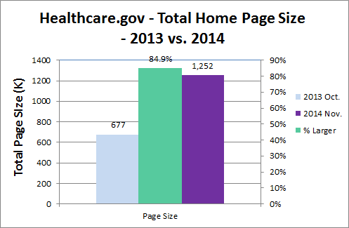
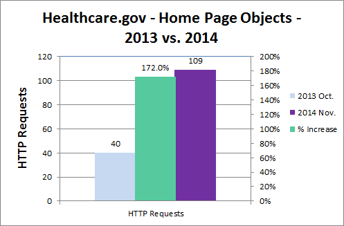
The home page of healthcare.gov grew significantly in size and complexity over the past year. Page size grew by 85% from 677K to 1252K (see Figure 2) and total objects grew by 172% from 40 objects to 109 objects (see Figure 3).
Home Page Response Times
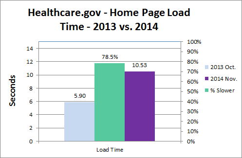
With the larger page size and complexity, the page load times and “above the fold” times increased proportionally for healthcare.gov. The load time increased by 78.5% from 5.9 seconds in Oct. 2013 to 10.5 seconds in Nov. 2014 (see Figure 4).
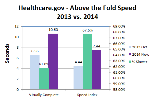
The “above the fold” response metrics also grew by 62% to 67% from Oct. 2013 to Nov. 2014 (see Figure 5). The visually complete metric grew from 6.5 seconds in Oct. 2013 to 10.6 seconds in Nov. 2014. Google’s speed index metric grew 67.6% from 4440 (4.4 seconds) to 7440 (7.4 seconds) over the same time period.
Wait Time Reduced & Errors
So the site is clearly larger and slower, but how consistent is the response time under load? The site takes advantage of Akamai and reportedly has more backend infrastructure. The site didn’t have as many “waiting room” delays as before, but still spawned a few errors (see Figure 6).
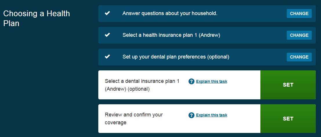
One nice feature about the website is that you can create your health plan in stages, and come back later to finish (see Figure 7).
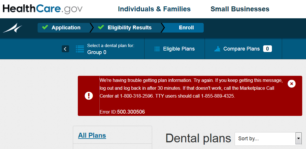
Unfortunately selecting a dental insurance plan spawned the following error repeatedly, despite numerous phone calls to the help line (see Figure 8).
This error code corresponds to a website issue. Users seeing this error are told to wait a while to see iand try again, or delete their 2015 plan and create a new one.
Healthcare.gov Performance Analysis
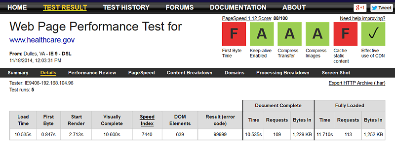
Let’s take a look behind the screens to analyze why healthcare.gov is slower than before. The overall page results are shown in Figure 9.
The load time of the home page was 10.5 seconds (median run of 5 runs), with a TTFB of 0.85S and a start render of 2.71 seconds (which is actually faster than one year ago).
Healthcare.gov Home Page Waterfall
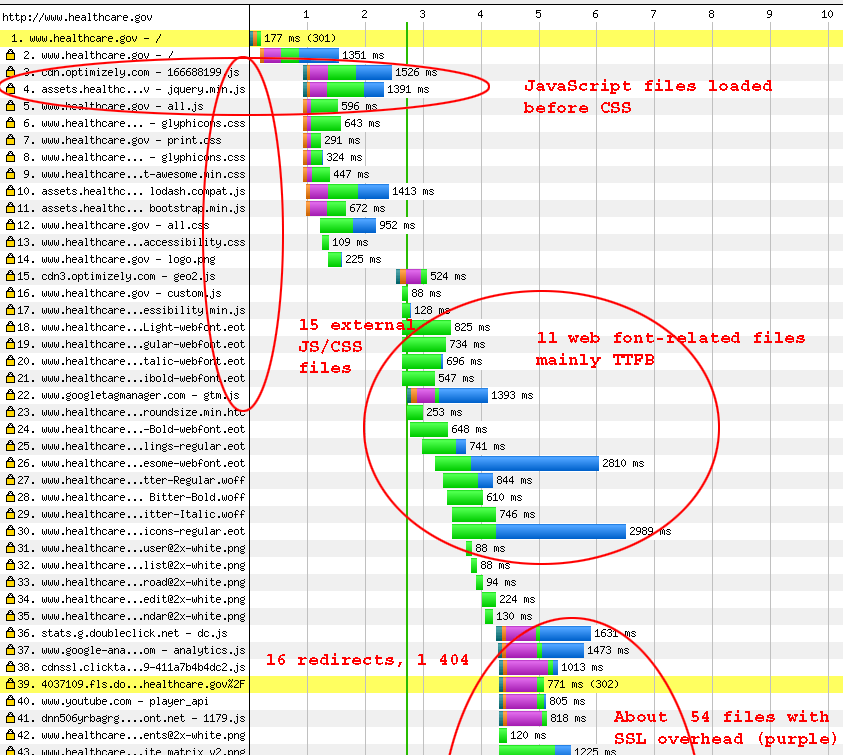
A waterfall (DSL) of the loading sequence reveals some issues (see Figure 10).
The waterfall shows a number of performance issues including JavaScript loaded before CSS (can block rendering), 15 external JS/CSS files before the page starts to render in earnest, 11 web font-related files, 16 redirects and 1 404 error (file missing), and more than 50 files with SSL overhead. In the larger waterfall you’ll notice the Home.png main banner image loads slowly, it was 471K! Optimized in Photoshop as a JPEG shrunk the file to 26K (see Figue 11)
Summary of Performance Issues
The home page has grown to 1.23MB requiring 113 requests. This is smaller than the average top 1000 page size (1807K) and about the same as the average number of objects (114, source httparchive.org). Here are the issues with the new healthcare.gov website (many of which are still there from one year ago):
- MINIMIZE HTTP REQUESTS: Too many HTTP requests 109 load/113 fully loaded
- IMPOVE CACHING: Poor caching 7/100 no max-age or expires headers
- LOAD CSS EARLY: JavaScript loads before CSS files (can block rendering)
- OPTIMIZE IMAGES: Unoptimized images (home.png main banner = 471K, optimized is 26K JPEG
- COMBINE JS/CSS FILES: 14 JS/CSS files before onload
- MINIMIZE WEB FONT USE: 11 webfont-related files
- AVOID REDIRECTS: 16 redirects, 1 404
- USE CSS SPRITES: 7 requests could be saved combining images into a CSS sprite
- USE DEFLATE COMPRESSION: GZIP compession could save 42K on home page html (more for other/external files)
- DEFER PARSING of JS (345K parsed during load)
- LOCALIZE EXTERNAL FILES: 78 external requests with associated delays
- MINIFY JAVASCRIPT: Unminified JS (minify JS 32.9K saved)
- IMPROVE TTFB: Slow TTFB 0.847S
- AVOID SSL OVERHEAD: SSL overhead on over 50 objects
Conclusion
While the healthcare.gov website has improved in availability and consistency, performance problems remain one year later. Healthcare.gov home page response times have slowed down by 62% to 78%, while page size and complexity have grown by 85% to 172% over the past year. We offer some triaged recommendations to improve the speed of healthcare.gov.
Further Reading
- Healthcare.gov Performance Review
- This article evaluates the website performance issues of the healthcare.gov site, and offers some solutions to improve speed. A brief analysis shows a number of issues that could be addressed to improve the user experience. This was our initial analysis of the site shortly after it officially launched in October 2013.
- Healthcare.gov Website Performance Revisited
- To test President Obama’s promise that the new healthcare.gov web site would be fixed by December 1, we speed audited the improved site. The site showed some improvements in “above the fold” speed, but slower load times than the old version. Optimizing the site with Radware’s Fastview service could cut load times by more than 68%.


