A recent clickstream study revealed new information about how we use and peruse the Web. University of Hamburg researchers found that the Web is moving from a static hypertext information system to dynamic interactive services with rapid interactivity between man and machine. The authors recommend that web developers create concise, fast loading web pages to keep pace with the speed of web navigation.
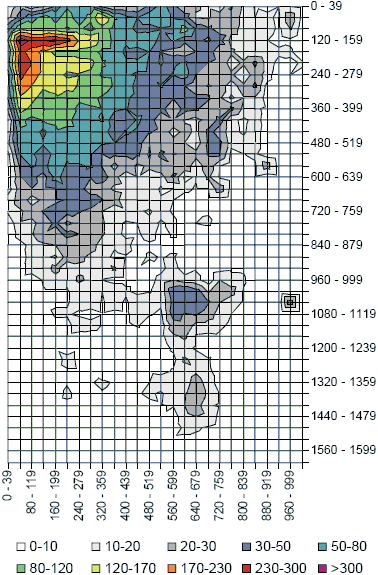
The Hamburg researchers also found an F-shaped pattern of clicking activity similar to results found in eye tracking studies (see Figure 1). There appears to be a strong link between our eye and hand movements over the surface of web pages.
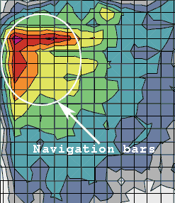
Figure 1: Clickstream Heatmap Closeup Shows Navigation Bars
Web Navigation Study: A Clickstream Analysis
In the largest web browsing study to date, Harald Weinreich and colleagues analyzed over 135,000 page visits by 25 experienced volunteers over a mean period of 105 days (Weinreich et al. 2006). Using instrumented browsers to “record the interaction with all user interface widgets” the researchers tracked actual user behavior over a long period while honoring privacy concerns. The clickstream and navigation logs were merged, filtered, and analyzed to glean insights into how we interact with the Web.
The Evolution of Web Navigation
The researchers found that the nature of web navigation has changed over time. Comparing three web browsing studies ending in 1994, 1996, and 2005 revealed a shift in how users initiate web page visits (see Table 1). The most significant changes were the increase in submit and new window events and the decrease in the use of the back button.
Link following has remained the most common navigation activity, accounting for 43.5% of page transitions. Direct access through bookmarks, typing in urls, or home page buttons has remained relative steady around 10%. New windows has jumped from less than 1% to over 10% of all page transitions in the past 11 years. Form submission has increased from 4.4% to over 15% of all navigation actions reflecting the increase in web services. 43% of all form submissions involve search submission, followed by online dictionary and travel planners. With the increase in new windows and use of AJAX, the back button has dropped from over 35% to less than 15% of all page transitions. Overall the trend reflects an increase in interactivity and form submission, with a corresponding 50% drop in the use of the back button for web navigation.
| Catledge & Piktkow | Tauscher & Greenberg | Weinreich et al. | |
|---|---|---|---|
| Time of study | 1994 | 1995-1996 | 2004-2005 |
| No. of users | 107 | 23 | 25 |
| Length (days) | 21 | 35-42 | 52-195 |
| No. of visits | 31,134 | 84,841 | 137,272 |
| Recurrence rate | 61% | 58% | 45.6% |
| Link | 45.7% | 43.4% | 43.5% |
| Back | 35.7% | 31.7% | 14.3% |
| Submit | – | 4.4% | 15.3% |
| New window | 0.2% | 0.8% | 10.5% |
| Direct access | 12.6% | 13.2% | 9.4% |
| Reload | 4.3% | 3.3% | 1.7% |
| Forward | 1.5% | 0.8% | 0.6% |
| Other | – | 2.3% | 4.8% |
Search Query Length
The average length of all search queries including reformulations was 2.57 words, with new queries averaging 2.14 words per query (see Figure 2).
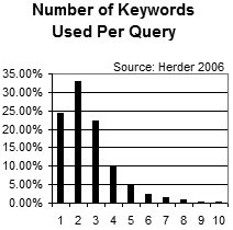
Figure 2: Number of keywords per query
Page Revisit Method versus Time
In order to characterize how users return to web pages team member Eelco Herder tested how users revisit pages versus the time between revisits using four intervals: within an hour, a day, a week, and longer than a week (Herder 2006). For short term revisits within an hour the back button predominates (see Figure 3). For medium-term revisits within a day the page address is typed directly into the address bar, with users relying on the autocomplete feature in most browsers. Longer term, after some URLs are forgotten by browsers and users, link following dominates how users revisit web pages with over 67% of revisits.
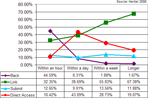
Figure 3: Access Methods For Shorter And Longer Term Revisits
Clickstream Heatmaps Resemble Eye Tracking Heatmaps
The clickstream results show a similar F-shaped triangular pattern to heatmaps derived from eye tracking studies (see Figures 4 and 5 and Hotchkiss 2005, Nielsen 2006). User click patterns appear to follow eye fixations. Weinreich found that the most active selected area is located in the upper left corner of the page: over 45% of all user clicks occurred in a region slightly larger than the upper left quadrant of the visible page (520 x 400 pixels). Figures 1 and 4 show that horizontal and vertical navigation bars (at least their left and top-most portions) are used most heavily. Weinreich and company also found an unexpectedly active area in the lower right part of the page, at around 600 x 1000 pixels. This turned out to be where Google placed their next page link, forcing most users to scroll.
Figure 4: Link activity areas of Web users – Clickstream Heatmap
Source: Weinreich et al. 2006. Used with permission |
Figure 5: The Golden Triangle – Eye Tracking on Google Results
Source: Hotchkiss 2005 Note: These two heatmaps are scaled to match vertically at 800 pixels in height. |
Weinreich found that over three quarters (76.5%) of the selected links were in the visible area at load time (see Table 2). User rarely scroll horizontally (total of 0.4%), but over 23% of all links followed were “below the fold.” This is surprising considering the short mean stay time on pages.
| Visible Area | Right of Visible Area | |
|---|---|---|
| Visible Area | 76.5% | 0.3% |
| Below Visible Area | 23.1% | 0.1% |
Average Screen Dimensions
Although all survey participants used a screen resolution of at least 1024 by 768 pixels, most did not utilize their entire screen for browser windows. Smaller windows, toolbars, and other widgets left users with about 160 horizontal pixels and 170 vertical pixels unused. For 1024 by 768 screen users, the average available document width was about 890 pixels (see Figure 6). The clickstream results confirm this, with clicks dropping off dramatically after about 880 pixels in screen width (see Figure 4). The authors recommend flexible layouts that leave at least 15% of screen width unused.
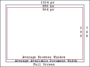
Figure 6: Screen Real Estate
Average Web Page Statistics
Weinreich and Herder analyzed users interacting with over 65,000 unique URIs. The average web page had 53 hyperlinks and 551 visible words. Stay times were short, 25% of all documents were displayed for less than 4 seconds and 52% of all visits were shorter than 10 seconds with a peak value located between 2 and 3 seconds (see Figure 7). Users averaged 3.25 sessions and 77 minutes per day. The median session length was 13 pages, but the majority of sessions were 34 pages or longer.
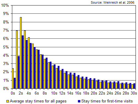
Figure 7: Distribution of stay times for all participants
Average Webpage Download Times
Web page download times were measured at different bandwidths (see Figure 8). Web performance was poor for ISDN users with less than 60% of all documents downloading completely within 4 seconds. Download times for dial-up users would be about 1.6 to 2 times slower than ISDN users.
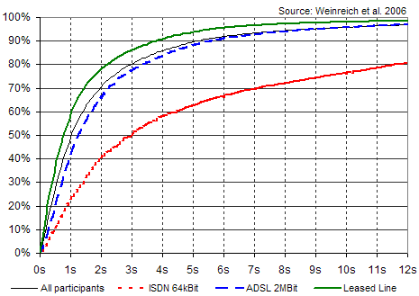
Figure 8: Web Page Download Times By Bandwidth
Conclusion
The nature of web navigation is changing from static information delivery to dynamic interactive web services. The speed of web navigation is high with short stay times, but long download times for ISDN and dial-up users. To enable rapid interactivity web designers should design fast loading web pages with concise headlines and be aware of web page hot spots to maximize conversion rates.
Further Reading
- Catledge, L.D., Pitkow, I.E., “Characterizing browsing strategies in the World-Wide Web,”
- Computer Networks and ISDN Sysytem, 1995, (27)6: 1065-1073.
- Clickdensity
- Web service to create clickstream heatmaps. Similar to web analytics services, Clickdensity requires adding a few lines of JavaScript to target pages. On non-framed, fixed layouts the service records clicks and creates heatmaps.
- Herder, E., “Forward, Back and Home Again – Analyzing User Behavior on the Web,”
- Herder’s detailed examination of the Web and web navigation expands our knowledge of user interaction with the Web. Includes an expanded version of the long-term browser study the Weinreich report is based upon. Ph.D. Thesis, University of Twente, April 13, 2006.
- Hotchkiss, G., “Did-it, Enquiro, and Eyetools uncover Search’s Golden Triangle,”
- Results from an eye tracking study of Google result pages reveals a triangular shaped “golden triangle” of eye fixation activity. Enquiro, 04/2005.
- Nielsen, J. “F-Shaped Pattern For Reading Web Content,“
- Eyetracking visualizations show that users often read Web pages in an F-shaped pattern: two horizontal stripes followed by a vertical stripe. Found that users scan web pages quickly, and focus on the first few words of headlines and top paragraphs. Jakob Nielsen’s Alertbox, April 17, 2006.
- Nielsen, J. “Screen Resolution and Page Layout,”
- Recommends that we optimize Web pages for 1024×768, but use a liquid layout that stretches well for any resolution, from 800×600 to 1280×1024. 60% of all monitors are set to 1024×768 pixels. Jakob Nielsen’s Alertbox, July 31, 2006.
- Tauscher, L., Greenberg, S., “How People Revisit Web Pages: Empirical Findings and Implications for the Design of History Systems,”
- Int. J. of Human Computer Studies, 1997, 47(1): 97-138.
- Weinreich, H., Obendort, H., Herder, E., and M. Mayer, “Off the Beaten Tracks: Exploring Three Aspects of Web Navigation,”
- In the largest clickstream study to date University of Hamburg and Twente researchers instrumented web browsers to track user behavior when interacting with web pages. The authors found evidence that the nature of Web interaction is changing from static information delivery to more dynamic interactivity. The strong increase in submit events indicates more dynamic web applications, and the increase in new windows shows more parallel paths. The authors found similar F-shaped patterns of link following activity to eye tracking study heatmaps. Most selected links reside in the upper left quadrant of the browser window, and users don’t utilize their entire screens (890 pixels wide on average). The authors conclude that browsing is a rapid interactive activity, with pages viewed for a brief period, and recommend that developers create concise, fast loading web pages. In Proc. WWW 2006, (ACM Press 2006).

“Users averaged 3.25 sessions and 77 minutes per day. The median session length was 13 pages, but the vast majority of sessions were 34 pages or longer.”
How does this reconcile with “Stay times were short, 25% of all documents were displayed for less than 4 seconds and 52% of all visits were shorter than 10 seconds with a peak value located between 2 and 3 seconds (see Figure 7).”
Users are online for 77 minutes. They hit two sites in under ten seconds and then hit a third site where they view 34 or more pages?
Tim, in this article the term ‘session’ refers to a navigation session (a sequence of page visits, session borders are defined by 25.5 minutes of no page requests) – a navigation session typically involves more than one Web site.
The sentence “the vast majority of sessions were 34 pages or longer” is slightly incorrect. In the distribution of session lengths (in terms of page visits), the upper quartile involves sessions with more than 34 page revisits. By their very nature, these longer sessions cover over 70% of all page visits.
Within these navigation sessions, users displayed a rapid click-through behavior; typically, several pages are visited quickly one after another, followed by a ‘content’ page on which they stayed slightly longer. As known from earlier studies, users often changed between Web sites.
Eelco,
Thanks for your input into my article about your study. I removed the word “vast” from the sentence you referred to. Let me know if you have any other suggestions.
The “Golden Triangle” Placement suggests that users behave on web pages as they would on print pages, reading from left to right, top to bottom…
I wonder how users behave on right to left pages? (Arabic or Hebrew)
The question is precisely:
Is this eye movement, click stream pattern a cultural thing or is it universal? Should we build pages in Arabic with navigation bars on top-left corner? Or consider print media reading pattern of the target culture as a basis for web ergonomics?
Thanks for clarifying the definition of “session” and the distinction between median and majority.
I have another question: in your response what is the difference between “visits” and “revisits” vis-a-vis “more than 34 revisits?”
Good studies have been made here, really helpful to understand the web dynamics.
Hassan, the term ‘revisits’ in my response was an unfortunate typo; I actually meant ‘sessions with more than 34 visits’. Sorry for the confusion.
Speaking of revisits: it may be interesting to know that the far majority of page revisits (74%) are backtracking activities (returns to pages visited in the same session) – presumably to navigational hubs, such as sites’ home pages and search results.
On the other hand, shorter sessions (with less than fifteen page visits) are more likely to be utilitarian in character, with a high percentage of visits to pages from earlier sessions (such as popular news sites, blogs, bulletin boards).
MR. herder, my comment/ question was actually about right 2 left languages, anything on that topic?
MR. herder, my comment/ question was actually about right 2 left languages, anything on that topic?
Eelco – thanks for clarifying the difference between
visits and revisits.
Interesting information. If you were to affix other labels to these two types of sessions – “backtracking” and “utilitarian” – what would they be?
I wrote a couple of posts about creating clickmaps fast and free. The heatmap one, using Imagemagick, is at http://blog.corunet.com/how-to-make-heat-maps/
Hassan, you’re right; I confused your post with Tim’s. Unfortunately, we do not have any data on people working with Hebrew or Arabic sites. I just did a quick check on Arabic site layout using http://www.onlinenewspapers.com/.
Apparently, the screen layout of quite some pages is strictly right-to-left, whereas about as many other pages adopt the ‘Western’ left-to-right page layout, despite the right-to-left writing system.
My best bet is that Arabic readers will initially glance over the page to check which design paradigm is being used. On strictly right-to-left sites, the ‘Golden Triangle’ will most likely be mirrored.
Tim. In addition to our (not particularly surprising) finding that shorter sessions are typically more utilitarian, we were able to separate search-intensive sessions from browsing sessions.
Search-intensive sessions are obviously characterized by a larger relative amount of queries and more first-time page visits (users were looking for new information and services). Browsing sessions involved less queries and more revisits.
More information and data on session categorization can be found in chapter 3 of my thesis, in which various related laboratory and field studies are discussed. In particular the study by Sellen, Murphy and Shaw ‘How Knowledge Workers Use the Web’ (Proc. Chi 2002) might be of interest.
“In the largest web browsing study to date, Harald Weinreich and colleagues analyzed over 135,000 page visits by 25 experienced volunteers over a mean period of 105 days (Weinreich et al. 2006).”
I must be reading this wrong… how are ’25 experienced volunteers’ representative of internet users in general?
Thank you for your insightful and thought-provoking article. In my case, it raised two immediate questions.
Scrolling: behaviour and design practices
Depending on who you ask, pages with content below the fold is considered as less than ideal. More than one usability expert has written against forcing the user to scroll.
But I interpret the following paragraph in the main article to mean not only that users do scroll vertically, but also that they follow links below the fold:
“Weinreich found that over three quarters (76.5%) of the selected links were in the visible area at load time (see Table 2). User rarely scroll horizontally (total of 0.4%), but over 23% of all links followed were “below the fold.” This is surprising considering the short mean stay time on pages.”
Then, Eelco Herder made this comment on July 27:
“Within these navigation sessions, users displayed a rapid click-through behavior; typically, several pages are visited quickly one after another, followed by a ‘content’ page on which they stayed slightly longer. As known from earlier studies, users often changed between Web sites.”
If we combine these two thoughts, can we conclude that users do not mind scrolling, once they are engaged?
Can we say that links that enable users to find the content they need should ideally be above the fold, and that related information is fine below the fold?
Opening new windows:
“New windows has jumped from less than 1% to over 10% of all page transitions in the past 11 years.”
Would the number of pages opened in new tabs (for instance, in Mozilla or Firefox) be included in the number of new windows opened?
Best regards
Jaco
Jaco,
Thanks for your feedback. The scrolling and above or below the fold issues are long-standing ones. Users clearly don’t like to scroll horizontally, and the statistics above show only 0.4% scroll to the right of the visible area.
The “fold” is a slowly moving target, as the dominant screen resolution increases, see Jakob Nielsen’s article on this below:
Screen Resolution and Page Layout
Looking at the clickstream heatmap above most of the activity is above the 760 to 800 pixel level, with low amounts of activity below this level (max of 30-50 versus 300+). So nearly 10 times less activity below the fold. The authors attribute the blue hotspot below the fold to the next/previous links on Google search results.
Putting your most important content above the fold (navigation, logos, search, newsletter signup forms, etc.) is good practice and gives higher clickthroughs (what we found at webreference.com), and a number of sites (IBM.com for one) are designed to fit the dominant screen resolution.
However, not all articles can be formatted to fit within one screen, including this one. This data shows that for high traffic “gateway” pages (home pages, sitemaps, etc.) putting your most important content in the initially visible area is a best practice. Once the user chooses to read an article, I think they are willing to scroll.
What about smaller form factor screens? Handhelds and other gizmos don’t have nearly the resolution of 1024×768 computer monitors. You can sniff and dynamically deliver different style sheets for different form factors, if you’ve designed your pages with this in mind.
Was there any data collected as what visitors actually clicked? Were they text links, image links, or banner type of links? Were they internal or external links?
This is some very useful information. The ability to map what visitors to a search page look at is very valuable information. Thanks.
Hi,
I read this post and in this article the term ‘session’ refers to a navigation session (a sequence of page visits, session borders are defined by 25.5 minutes of no page requests) – a navigation session typically involves more than one Web site.
The sentence “the vast majority of sessions were 34 pages or longer” is slightly incorrect. In the distribution of session lengths (in terms of page visits), the upper quartile involves sessions with more than 34 page revisits. By their very nature, these longer sessions cover over 70% of all page visits.
Within these navigation sessions, users displayed a rapid click-through behavior; typically, several pages are visited quickly one after another, followed by a ‘content’ page on which they stayed slightly longer. As known from earlier studies, users often changed between Web sites.